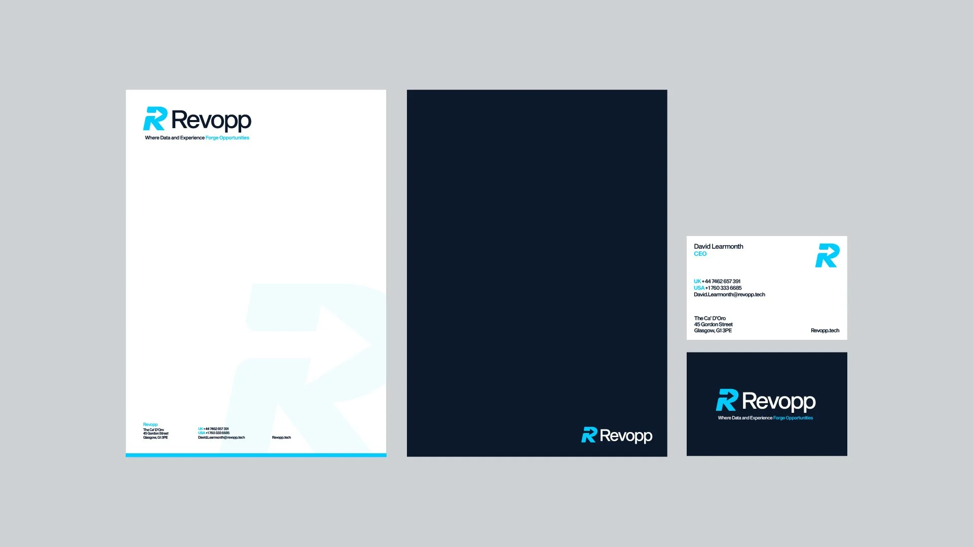
A brand guidelines document sets the fixed rules for how a business looks, sounds, and behaves everywhere it appears: logo usage, exact colour values, typefaces, imagery style, and tone of voice, all in one place. Small businesses benefit disproportionately because consistency builds recognition and trust while costing almost nothing once it's written down. The strongest guidelines specify precise values, HEX, RGB, and CMYK for colour, minimum sizes and clear space for logos, and real on-brand versus off-brand writing samples, rather than vague direction like "use blue." Most weak guidelines fail because they cover only the logo, ignore digital touchpoints, or get written once and never updated. A single page covering logo rules, colours, fonts, and tone already puts a small business ahead of most competitors its size, and that page can expand as the business grows.
Brand guidelines are the rulebook for how your brand looks, sounds, and behaves everywhere it shows up. They pin down your logo usage, colours, typography, imagery, and tone of voice in one document so that your business looks like the same business whether someone finds you on Instagram, opens an email from you, or walks past your van. For a small business, that consistency is worth more than most owners realise, and it costs almost nothing to protect once it's written down.
Here's what you'll get out of this guide: a plain definition, a breakdown of what belongs inside a set of brand guidelines, a step-by-step way to build your own, the mistakes that trip people up, and how to keep the whole thing alive once it exists. No jargon, no filler.
What are brand guidelines?
A set of brand guidelines is a reference document that defines the visual and verbal rules of your brand. Think of it as the instruction manual anyone would need to represent your business correctly without asking you first. A printer, a freelance social media manager, a new hire, a web developer, your future self at 11pm reformatting a proposal: they all pull from the same source and land in the same place.
The document usually covers how your logo can and can't be used, your exact colour values, which fonts to set text in, the style of photography or illustration you use, and how you write. Some guidelines are two pages. Some run to sixty. The length matters far less than whether the rules are clear and someone can follow them.
The terminology gets muddled, so let me clear it up. Your brand identity is the actual collection of assets: the logo, the palette, the typefaces, the voice. It's the raw material. Your brand guidelines (sometimes called a brand style guide) are the document that explains how to use that material correctly. A brand book tends to be the richer, story-led version that includes your mission, values, and personality alongside the practical rules, often used to sell the brand internally or to investors. In practice these terms overlap and nobody polices them, but the useful distinction is simple: identity is what you have, guidelines are the rules for using it. Branding, as I've argued before, is much bigger than a logo on its own, and guidelines are where that wider system gets documented.
Consistency across touchpoints builds recognition and trust faster
Consistency builds recognition, and recognition builds trust. When your colours, type, and tone stay the same across every touchpoint, people start to recognise you faster and, without thinking about it, they read that steadiness as competence. A brand that looks different on every platform reads as either brand new or slightly disorganised, and neither helps you win work.
There's a practical efficiency angle too. Without guidelines, every new piece of content becomes a fresh set of decisions: which blue, which font, does the logo sit here or there? That's slow, and it's where inconsistency creeps in. With a document to point at, those decisions are already made. You brief a designer or a printer, hand over the guidelines, and skip the three rounds of back-and-forth that would otherwise happen.
The moment you involve anyone else in your brand, guidelines stop being a nice-to-have and start being the thing that stops your brand drifting.
And you will involve other people. The day you hire a virtual assistant, commission an ad, or brief a freelancer to run your social media marketing, your brand is now in someone else's hands. Guidelines are how you keep control of it without hovering over every post.
Key components every set of brand guidelines should include
Not every business needs all of these, but the strong ones cover most. Here's what earns its place.
Logo usage rules prevent shrinking, stretching, and misapplication
This is usually the biggest section, and rightly so. Show every approved version of the logo: the primary lockup, any secondary or stacked variants, the icon or monogram on its own, and the reversed (white) version for dark backgrounds. Then set the rules. Specify the minimum size so it never appears too small to read, define the clear space that must surround it, and show the misuses: don't stretch it, don't recolour it, don't add a drop shadow, don't place it on a busy photo. A grid of "don'ts" saves you more grief than almost anything else in the document.
Exact colour values across HEX, RGB, CMYK stop printing surprises
List your primary and secondary colours with exact values for each context. That means HEX for web, RGB for screen, CMYK for print, and a Pantone reference if you print anything physical. A colour that looks right on your monitor can print as a muddy near-miss, and specifying the values is how you stop that. It's worth noting which colours are dominant and which are accents, so nobody floods a layout with what was meant to be a highlight.
Typeface hierarchy and sizing make headings recognisable everywhere
Name your fonts and show the hierarchy: which typeface for headings, which for body, and any web-safe or fallback fonts for situations where the brand font can't be embedded. Include sizing and weight guidance so headings feel like headings everywhere. If you're weighing up typefaces in the first place, the difference between serif and sans serif on the web is a sensible place to start thinking about tone.
Photography style carries as much brand weight as design
Define the look and feel of your visuals. Bright and airy or moody and dark? Real photography or illustration? People-focused or product-focused? A few example images that fit, and a few that don't, communicate this faster than a paragraph ever will. The pictures you use carry as much brand weight as the design around them, which is why the photos on your website deserve the same care as the layout.
Tone of voice is the half of branding most businesses skip
Sound is half your brand, and it's the half most small businesses forget to write down. Describe how you speak: formal or casual, playful or direct, technical or plain. Give real before-and-after examples of a sentence written on-brand versus off-brand. If you want a proper framework for pinning this down, I've written a full walkthrough on defining your brand's tone of voice that pairs directly with this section.
Whitespace and layout rules separate considered from cramped
The details that hold everything together: how much whitespace to leave, how elements align, how to lay out common templates like a business card or a social post. Generous space is a design choice in itself, and using whitespace deliberately is often what separates a brand that looks considered from one that looks cramped.
Start by gathering what you already have, then lock down the logo
You don't need a design degree to draft a working version. Here's a sensible order to build it in.
Gather what you already have. Pull together your logo files, any colours you've used, the fonts on your website, and a handful of the marketing pieces you're happiest with. This is your starting material.
Lock down the logo rules. Decide which versions are official, retire the rest, and write the size, spacing, and misuse rules around them.
Define your colours precisely. Choose your core palette, then record the HEX, RGB, and CMYK values so there's no ambiguity later.
Set your type system. Pick your heading and body fonts, assign a hierarchy, and note any fallbacks.
Describe your imagery and voice. Write the imagery style with examples, then draft your tone of voice with on-brand and off-brand samples.
Add usage examples. Show the rules applied to real things: a mocked-up social post, a header, an email signature. Seeing the system in use makes it click for whoever reads it.
Compile and share it. Put it into one document, whether that's a PDF, a shared doc, or a hosted page, and store it somewhere people can find without digging.
If you're building the brand alongside a website, the guidelines and the site should be drawn up together rather than in sequence. That's roughly how my own branding process runs from start to finish, because the decisions you make about type and colour need to hold up on screen, not just on paper.
A clean PDF works for most small teams; hosted versions scale further
You can build guidelines in almost anything, from a well-formatted document to purpose-made software. The right choice depends on how many people need access and how often it changes.
For a solo operator or a small team, a clean PDF built in a design tool is usually enough. A shared document works too, and has the advantage of being easy to edit. If you want a browser-based, always-current version that teams can log into, dedicated brand guideline platforms let you host everything online with downloadable assets attached. There are several established players in that space, and their pricing and plan structures shift often, so check each provider's own pricing page for what's current rather than trusting a number in a blog post. Household design tools with template libraries are a reasonable middle ground if you want structure without a subscription to a specialised platform.
My real recommendation: don't over-tool this. A five-page PDF that people read beats a slick hosted portal that nobody opens. Match the tool to the size of the problem.
Vague rules, logo-only focus, and digital blindness cause most failures
Most weak guidelines fail for the same handful of reasons:
They're too vague to follow. "Use blue" isn't a rule. "Use #1B3A5B as the primary, #E8C547 as the accent" is. If a stranger couldn't act on it, tighten it.
They cover the logo and nothing else. A logo-only document isn't a brand guide. Voice, imagery, and layout are where consistency really shows up day to day.
They ignore digital. Print-era thinking still shows up in guidelines that specify letterheads but say nothing about social templates, web components, or how the brand behaves in motion. Most small businesses live online, so the digital rules should carry the most weight.
They're written and then forgotten. A guide that isn't shared, or that never gets updated, drifts out of date and gets ignored without anyone noticing.
They're overbuilt. A one-person business does not need a sixty-page brand book. Build for the scale you're at, and expand when you grow.
Store guidelines in one permanent place and brief everyone who uses them
Writing the document is the easy part. Making people use it is where the value gets realised or lost.
Start by storing it somewhere obvious and permanent, not buried in an email thread from last year. A shared drive folder, a link in your team handbook, or a hosted page all work as long as there's a single known home for it. When you brief anyone external, a printer, a freelancer, an ad platform, send the guidelines with the brief every time, not on request. It should be the default attachment.
Version it as it changes. When you update a colour or add a new logo variant, note the date and what changed, and make sure the old version stops circulating. This matters far more once you're working with remote collaborators or an agency, where an outdated file can spread across a dozen assets before anyone notices. A simple line at the front of the document, "Version 2, updated July 2026", saves a surprising amount of confusion.
For distributed teams, pair the rules with ready-made templates. People follow guidelines far more reliably when the on-brand option is also the easy option, so a locked social template or a pre-set email signature does more for consistency than a paragraph telling people what not to do.
Start with logo rules, colours, fonts, and tone on a single page
If you don't have brand guidelines yet, start small and useful rather than large and unfinished. Write down your logo rules, your exact colours, your fonts, and a couple of lines on how you sound. That single page already puts you ahead of most businesses your size, and you can grow it as you go. The point isn't a polished manual; it's consistency you can hand to someone else.
If pulling that together feels like the job that never reaches the top of the list, that's usually the moment to bring in help. Building brand guidelines is part of the brand identity work I do with small businesses, and it's often the piece that makes everything else, from your website to your next rebrand, far less painful. Draft your one-pager this week, and see how much faster your brand decisions get once the rules already exist.